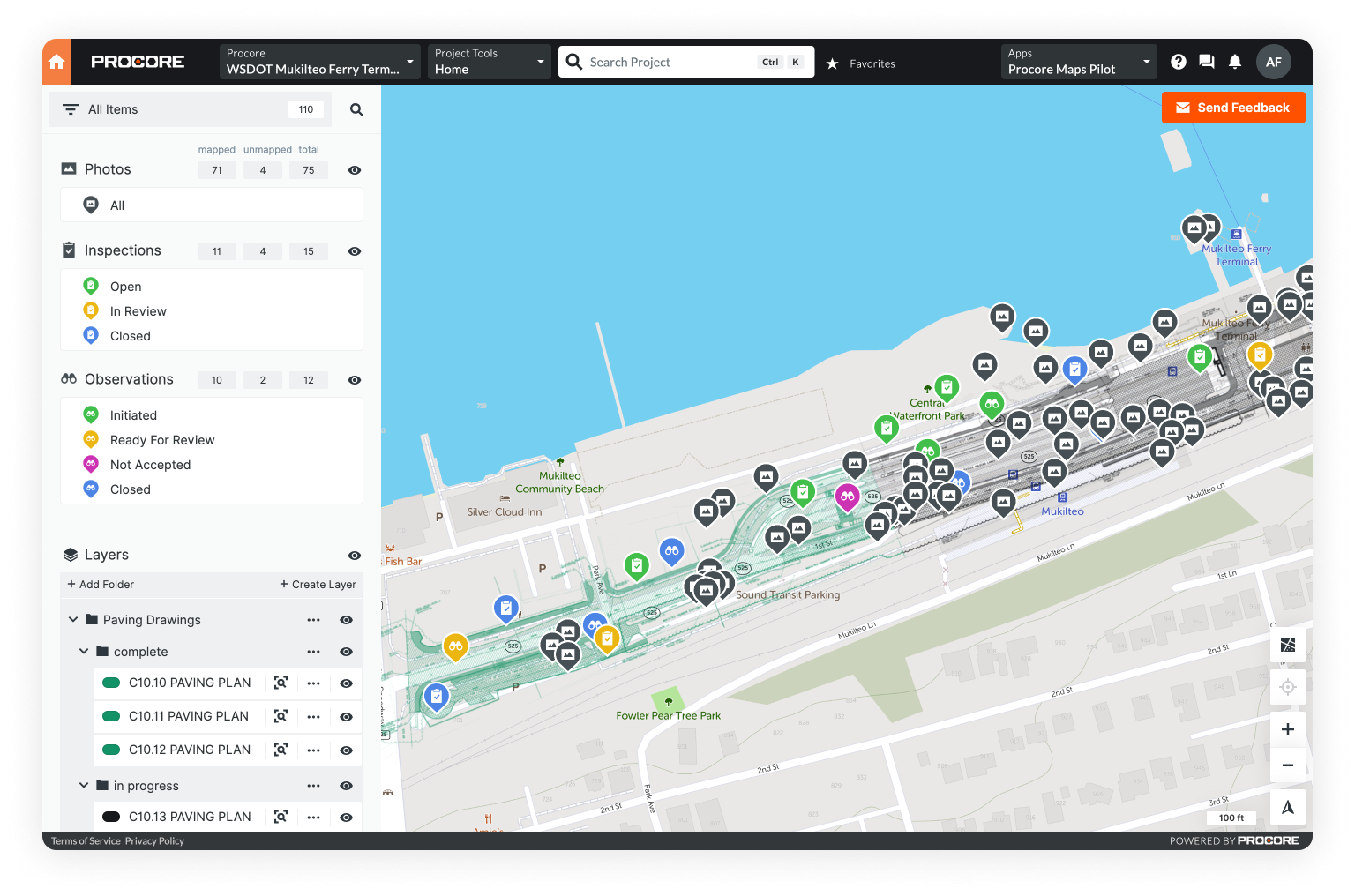
Making good maps is as simple as following a few straightforward guidelines.
In this post, we take it back to basics: exploring common map elements, best practices for easy-to-read map layouts, and the fundamentals of map design.
You don’t have to be a professional cartographer, or have a degree in geographic information systems (GIS) to create beautiful maps. With online mapping platforms and the right guidelines, anyone can create a compelling cartographic display.
Not sure where to start? Learn How to Choose the Best Mapping Software for You.
What Is A Map?

The definition of a map is likely more complex than you think.
Yes, maps often depict a location and the relationship between elements within that area. However, throughout history maps have also depicted myths, religious beliefs, and even theories about the future.
Ultimately, the definition of maps can be boiled down to one unifying theme:
Maps are a symbolic representation of place.
They are not perfect replicas of reality. Compared to ancient maps, fidelity has increased significantly and modern cartography is more accurate than ever before. However, a map maker must still interpret reality and then represent it - opening space for some level of distortion.
While most people can likely identify a map, not many can name each specific map element. We'll take a look at those next.
Map Elements
Most maps contain the same common elements: main body, legend, title, scale and orientation indicators, inset map, and source notes. Not all are necessary or appropriate for every map, but all appear frequently enough that they’re worth covering.

Main map body
Exactly what it sounds like, this is the map itself. All the other elements provide supplementary information meant to clarify and/or support the main map body.
Legend
Also known as a key, the legend explains any symbols used on the map. An effective legend should include a sample of the symbol and a short description of what that symbol indicates.
Title
The map title reflects the subject of the map. A good title should include the geographic name, the layer name, and the indicator name. For example, if your map depicts the location of parks in Seattle, a good title would be “Location of All Seattle Parks."
Inset map
This is a smaller map featured off to the side or in the corner of your main map. Inset maps typically show a specific area of the main map on a larger scale - giving more detail or adding emphasis to an area of interest.
Scale indicator
The scale is typically a ratio: one that relates a single map distance unit to a corresponding distance in the real world. This ratio is often represented as a fraction.
Orientation indicator
A map’s orientation is the relationship between the directions shown on the map vs. compass directions in reality. Google Maps, for example, always orients North to the top of the screen.
Source note
The source note shows viewers where the information displayed on the map came from. It serves the same purpose as a bibliography.
Creator graphic
This element is intended to tell the viewer who created the map. For individuals, the source graphic could simply be a subscript with their name. For organizations, it's often a logo.
5 steps to laying out a map
As we've mentioned, making good maps doesn't have to be complicated. Start with a question and make sure anything you add from there helps to support the answer.
Here’s our five-step process for creating an effective map layout.
1. Define the question
Your map should be visual representation of the answer to a question. So first, you need to define your question! Are you looking to relay general reference information? Or is there a specific theme you want to explore?
Once you know what your end goal is, you can gather data and start making decisions about how you want your map to look.
2. Choose a map type
Maps aren’t one-size-fits-all. Different map types are better suited to displaying different types of information.
Consider the question you’re trying to answer and the story you want to tell. These considerations should inform what map type you choose.
There are two broad map categories: reference and thematic.
Reference maps focus on location, depicting natural and/or man-made features.

Examples
- General reference
- Topographic
- Navigational
- Cadastral
Thematic maps illustrate spatial relationships, focusing on a specific theme or subject.

Examples
- Category maps
- Choropleth maps - Dot density maps
3. Consider your map elements
The map elements covered above are quite common in cartography, but remember - not all maps need to have every element. Ask yourself which elements will most help the viewer understand your map.
4. Establish a visual hierarchy
Visual hierarchy sounds fancy, but is actually pretty simple. Put the most important elements at the top, and the least important at the bottom.
Usually, this means including the main map body, title, and legend at the top. Context is important though, so your map could be organized differently.

5. Decide on design elements
Design is where you can start to have some fun. From colors, fonts, outlines, borders, and stroke widths - this is where creativity can take the wheel.
We'll explore the basics of good map design below.
Basics of Map Design
Color

When it comes to color, resist the temptation to go full rainbow. Colors should complement the intent of your map: adding another level of clarity.
Too many colors and/or unexpected color choices can overwhelm and confuse your viewer.
For example, using blue for a forest and red for the ocean is confusing. In contrast, using blue for the ocean (or any body of water), and green for the forest is much more clear.
Blue for water and green for trees are common color associations. Piggy backing on these widely known associations creates an easier viewing experience and, ultimately, a more effective map.
Outlines, borders, and stroke widths
When adding outlines and borders, or adjusting stroke widths be sure it fits within the context of your map.
Any additional design element should look like it belongs: emphasizing details or adding clarity.
Create emphasis by adding an outline, or increasing the stroke width. Just make sure you’re emphasizing the right elements. For example, if your map is depicting state capitals, but also includes other major cities - the capitals, not the other cities, should be in bold.
Borders are another way to draw the eye in and add clarity. For example, you can add a border to the inset map to make it clear that it's a seperate component.
Fonts

When it comes to fonts, recommended best practice is to limit yourself to two.
Serif/sans serif typefaces are map standards. Always use bold or normal font, as opposed to italic or cursive.
Your map title should be larger than the rest of your text, and you can play with putting it in bold. Subtitles and labels should be in a normal font that is readable, but not too large.
Getting started with online map makers
The main takeaway here is simple. When it comes to map making, clarity is key. Learning these map making basics will help to get you on your way.
Once you've learned the fundamentals, you can start exploring online map makers - which make it easy for anyone to create custom maps.
To jumpstart your journey, we’ve compiled a list of our favorites:
Best online map makers for…
Simple Points, Shapes, and Labeling
Software Developers & Programmers
Fantasy Map Making (Games, Books, D&D)
Mixed Datasets, Field Work, & Collaboration

Not yet ready to take the plunge?
Learn more about mapping in our posts on the History of Maps or Modern Cartography, find inspiration in 7 Cool Creative Maps That Anyone Can Make, or get more technical with our guide to GIS mapping.